Introduction
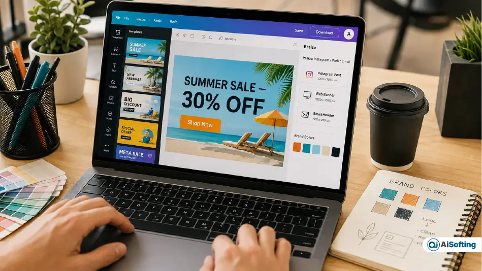
Not long ago, making a single banner meant booking time with a designer, waiting on revisions, and hoping the final file fit every platform you needed it for. Today, a marketing coordinator with zero design training can open a banner maker, type a short brief, and have a usable draft in the time it takes to make coffee. A banner maker builds your brand by keeping a consistent visual style across every channel it touches — which is exactly why this shift, from “wait for the design team” to “build it yourself in minutes,” is one of the quieter but more important changes in how small and mid-sized businesses handle their visual marketing.
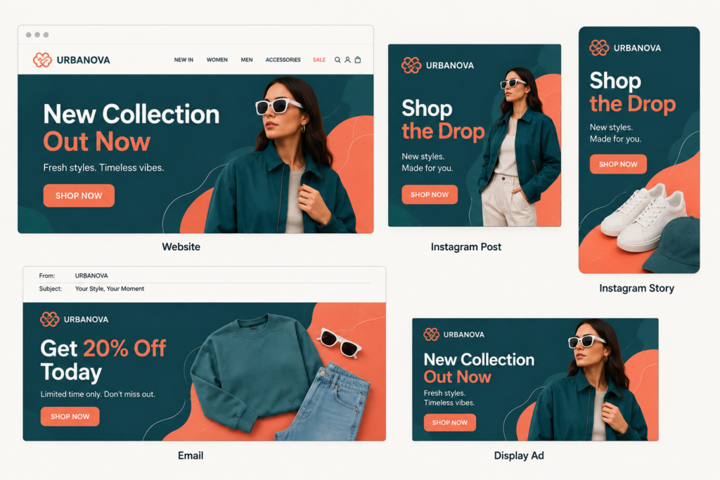
This isn’t just about speed, though speed matters. It’s about consistency. A good banner maker helps a business hold onto a recognizable visual identity — the same colors, fonts, and tone — across a website header, an Instagram ad, an email banner, and a trade-show screen, even when five different people on the team are the ones producing the content. For startups, marketers, e-commerce stores, and internal comms teams that need fresh visuals every week, that consistency is often worth more than the time saved.
In this guide, we’ll look at why businesses are adopting AI-assisted design tools, how to keep a brand identity intact across dozens of banner variations, the practical mistakes teams keep making, and a part of this conversation that rarely gets covered: what actually happens to a banner after it’s published — including banner blindness, accessibility, and how AI is starting to be used to fight both.
Why Businesses Are Moving Toward AI Design Tools
A traditional banner workflow usually looks like this: find inspiration, pick dimensions, build a layout, source imagery, adjust typography, then export several versions for different placements. Each step eats time, and multiplied across a dozen campaigns a month, it adds up to a real bottleneck.
AI-powered design platforms compress that process. Some can generate a starting concept from a text prompt; others lean on large template libraries that can be customized in minutes rather than hours. Adobe Express, for instance, lets users generate and resize banner designs without touching traditional design software, and its resizing tools are built specifically for teams producing the same campaign across multiple ad formats.
Research into AI-assisted design tools has also looked at how automated systems can generate fully editable output — not flattened images — so a marketer can still tweak the copy, colors, or layout after the AI does the first pass. That distinction matters. A locked, uneditable AI image is a dead end for a marketing team; an editable AI-generated banner is a starting point.
For businesses running several campaigns a month, this alone can turn banner production from a recurring bottleneck into a same-day task.
Building a Consistent Brand Identity Across Every Banner
A banner should do more than look good in isolation — it should feel unmistakably like it belongs to your business, even without a logo in the corner.
Before opening any design tool, lock down a few brand fundamentals:
- Brand colors (primary, secondary, and an accent color for CTAs)
- Logo placement rules (size, spacing, which version to use on light vs. dark backgrounds)
- Font pairing (a heading font and a body font, used consistently)
- Image or illustration style (photography vs. flat illustration vs. 3D render)
- Button and CTA styling
- Tone of voice in the copy
When these stay consistent, audiences recognize your business at a glance — on a website banner, in a social ad, or in an email — without needing to read the logo. That recognition compounds over time; it’s the same reason a Coca-Cola red or a Spotify green is identifiable from ten feet away.
Modern platforms make this easier to enforce than it used to be. Adobe Express, for example, lets teams save branded elements into a reusable kit instead of rebuilding them for every new campaign, which cuts down on the “off-brand banner” problem that happens when five different people are each designing from scratch. If you want a deeper look at how professional design teams structure this kind of visual system, our graphic design services breakdown covers the process end to end.
AI Makes Banner Creation More Accessible — Not Automatic
The appeal of AI design tools is that they lower the skill floor. You don’t need to know layout theory or color grading to get a usable result — you describe what you want, and the tool gives you a starting point.
Say a clothing brand’s marketing team needs a banner for a “Summer Sale.” They can prompt an AI tool for a summer-themed design, then adjust the colors, swap the imagery, and rewrite the copy to match their actual promotion and audience. What used to take a design brief, a back-and-forth with a freelancer, and a few days now takes an afternoon.
But there’s a catch worth stating plainly: AI should speed up the first draft, not replace the final judgment. Every AI-generated banner still needs a human check before it goes live — for accurate pricing, correct product names, brand-appropriate imagery, and a message that actually makes sense to the audience it’s aimed at. Teams that skip this step are the ones who end up with banners that look “off” without being able to say exactly why. AI is a drafting partner, not a replacement for someone who understands the brand.
Creating Multiple Banner Sizes Faster
Businesses almost never need just one banner size. A single campaign might require a leaderboard banner for a website, a square version for Instagram, a vertical story format, a rectangle for email, and a custom size for a specific ad network — five or six variations from one concept.
Rebuilding each size manually is one of the most time-consuming parts of the old workflow. Modern tools increasingly bake in automatic resizing: you build one master design, and the tool reflows text, images, and spacing to fit each new dimension. Adobe Express offers both preset ad and social sizes and custom dimensions, which removes a lot of the guesswork around platform specs.
This matters more than it sounds like it should. A campaign that’s visually inconsistent across platforms — different fonts, cropped-off logos, mismatched colors — reads as unpolished even if every individual banner is well designed on its own.
Better Visual Communication Across Teams
Banners aren’t just an external marketing tool anymore. Companies increasingly use them internally — for event announcements, all-hands presentations, recruitment campaigns, and employee updates. The Financial Times has reported on the growing role of visual communication inside workplaces, noting that visually driven content is spreading well beyond marketing departments into HR, operations, and leadership communications.
That spread makes accessible design tools more valuable company-wide, not just for the marketing team. An HR manager announcing an open role or a sales lead building a partner deck benefits from the same drag-and-drop simplicity that a marketer uses for an ad campaign.
The Banner Blindness Problem — And What AI Is Actually Doing About It
Here’s the part of this conversation that most banner-design guides skip entirely: even a beautifully designed banner has to fight against a well-documented psychological phenomenon called banner blindness — the tendency for users to subconsciously ignore anything that visually reads as “an ad.”
The numbers are blunt. Industry benchmarking in 2026 puts the average click-through rate for standard display banners at well under 0.5%, and roughly half of consumers say they actively ignore banner-shaped content on a page. This isn’t a new problem — researchers first documented it back in 1998 — but it’s exactly why design quality alone has never been enough to make a banner perform.
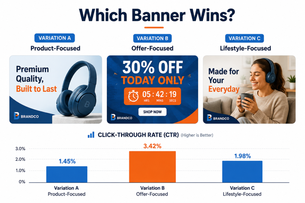
This is where AI tools are starting to add real value beyond just faster production: rapid variation testing. Instead of shipping one banner and hoping it works, teams can now generate five or ten design variations — different color schemes, different headline framing, different imagery — in the time it used to take to make one, then run them against each other to see what actually earns attention. This is essentially a lightweight version of the dynamic creative optimization (DCO) techniques that large programmatic advertisers have used for years, now accessible to a small marketing team without an ad-tech budget.
The practical takeaway: if a banner isn’t performing, the fix usually isn’t “make the logo bigger.” It’s testing a genuinely different visual angle — and AI tools have made that kind of testing fast enough to actually be worth doing.
Accessibility and Contrast: The Overlooked Ranking and Trust Factor
A related issue that rarely comes up in banner-design content: color contrast and text legibility aren’t just aesthetic choices — they affect whether real people, including those with low vision or color blindness, can actually read your message. The Web Content Accessibility Guidelines (WCAG) recommend a contrast ratio of at least 4.5:1 for normal text against its background. A banner with light gray text on a pastel background might look elegant in a mockup and be genuinely unreadable on a phone screen in daylight.
This has become more relevant as search engines and platforms increasingly factor accessibility and usability signals into how content is surfaced. A banner that’s hard to read isn’t just excluding some of your audience — it’s underperforming for everyone.
Practical Tips for Better Digital Banners
Before publishing any banner, run it through a short checklist:
Is the main message obvious in under three seconds? People should understand the point of the banner almost instantly — if it takes a close read, it’s already lost most viewers.
Does the design match the brand? Established colors, fonts, imagery style, and logo placement should carry over from your last ten banners, not reinvent them.
Is there too much text? Cut anything that isn’t the headline, a supporting line, and a call to action. Banners are skimmed, not read.
Does it hold up on different devices? Check the design at both desktop and mobile sizes — text that’s readable on a laptop can shrink to nothing on a phone.
Is the call to action unmistakable? Whether it’s “Shop Now,” “Register,” or “Learn More,” the next step should be visually obvious, not buried in the corner.
Common Mistakes Businesses Make With AI-Generated Banners
- Publishing the AI’s first draft without editing. The fastest way to end up with a generic-looking banner is skipping the customization step entirely.
- Ignoring brand guidelines in favor of whatever looks “cool.” A striking design that doesn’t match your brand does more harm than good long-term.
- Overloading the banner with text. More words rarely mean more clarity — usually the opposite.
- Forgetting mobile sizing until the last minute. A banner designed only for desktop often breaks on the format most people will actually see it in.
- Never testing variations. Given how cheap AI-assisted variation generation has become, sticking with a single untested design is leaving performance on the table.
The Future of Business Banner Design
AI and increasingly accessible design platforms are changing who can create digital content and how quickly they can do it. Businesses no longer need a full production pipeline just to launch a campaign visual.
But the strongest results still come from pairing the technology with human judgment. AI is excellent at generating options and handling repetitive resizing work; people remain responsible for strategy, brand direction, final messaging, and knowing when a design just doesn’t feel right, even if it can’t be explained in a checklist. Businesses working with sites, apps, and social platforms that share content across channels will keep needing tools that are fast and controllable — and design will keep being one part of a wider web presence strategy, not a standalone task.
Personal Experience: What I’ve Learned Producing Banners for Real Campaigns
I’ve spent a fair amount of time helping small marketing teams move from “one designer makes everything” to “the whole team uses an AI-assisted banner tool,” and a few lessons have held up consistently across different clients and industries.
First, the biggest early mistake is almost never a design mistake — it’s a brand-guideline mistake. Teams get excited about how fast they can produce banners and skip the step of locking in colors, fonts, and logo rules first. The result is a folder full of banners that are individually fine but collectively look like they came from five different companies. The fix took less time than expected: a one-page brand sheet with hex codes, font names, and two or three approved layout templates saved more back-and-forth than any tool feature did.
Second, I underestimated how much the “editable, not locked” distinction matters. Early on, we tried an AI tool that only output flattened images — great for a one-off social post, useless the moment someone needed to swap out a price or fix a typo. Switching to a tool that generated fully editable layers cut our turnaround time roughly in half, because nobody had to start over from scratch for small changes.
Third, testing variations genuinely changes outcomes, and most teams still skip it. On one retail campaign, we generated three versions of the same banner — one product-focused, one offer-focused, one lifestyle-focused — using an AI tool to speed up the variants. The offer-focused version outperformed the “prettier” lifestyle version by a wide margin. If we’d only shipped our first instinct, we’d have picked the wrong one. That single test reshaped how the team approached every campaign afterward: design for one strong idea, but always generate at least two real alternatives before committing a budget to one.
Finally, accessibility checks are the step almost everyone forgets until a customer complains. A pastel banner that looked great on a design monitor turned out to be nearly unreadable for a colorblind team member — something a quick contrast check would have caught in thirty seconds. It’s now a permanent line item on our pre-publish checklist.
Frequently Asked Questions
What is a banner maker, and do I need design experience to use one?
A banner maker is a design tool — often AI-assisted — that lets you build web, social, or print banners using templates, drag-and-drop editing, or text prompts. No formal design background is required; most tools are built for marketers, not designers.
Can AI-generated banners actually match my brand identity?
Yes, if you set up brand assets first. Most platforms let you save your logo, brand colors, and fonts into a kit that gets applied automatically, so AI-generated drafts start closer to on-brand rather than generic.
Are AI banner tools free to use?
Many, including Adobe Express, offer free tiers with core templates and resizing tools, with paid plans unlocking premium assets, brand kits, and advanced customization.
What banner size should I use for a website header?
Common website leaderboard banners run 728×90 or 970×250 pixels, but this varies by placement — always check your specific platform’s current ad specs before finalizing a size.
Why do my banners get so few clicks even though they look good?
This is usually banner blindness, not a design flaw — average display ad click-through rates sit well under 1% industry-wide. Testing different messaging angles (offer vs. lifestyle vs. product) tends to move the needle more than visual polish alone.
Should I use AI to write the banner copy too, or just the design?
AI can draft copy quickly, but banner copy is short and high-stakes — always have a human review it for tone, accuracy, and brand voice before publishing.
How many banner variations should I create per campaign?
At minimum, two to three meaningfully different angles (not just color swaps) tested against each other, especially for paid campaigns where performance data can guide future creative.
Do banners need to meet accessibility standards?
Yes — aim for a text-to-background contrast ratio of at least 4.5:1 per WCAG guidelines, and avoid relying on color alone to convey meaning (e.g., “click the green button”).
What’s the difference between a banner maker and a full graphic design service?
A banner maker is self-serve and fast, suited for frequent, lower-stakes content. A professional graphic design service is better suited for brand-defining assets like logos, packaging, or a complete visual identity system.
Conclusion: Actionable Takeaways
AI and accessible design platforms have genuinely changed who can produce professional-looking banners and how fast they can do it — but the businesses getting the most value aren’t the ones handing everything to AI. They’re the ones using AI to speed up drafts and resizing while keeping a human in charge of brand consistency, message accuracy, and testing.
A few things worth doing this week if you’re rethinking your banner workflow:
- Build a one-page brand kit (colors, fonts, logo rules) before your next campaign, not after.
- Choose a tool that outputs editable designs, not flattened images.
- Generate at least two meaningfully different creative angles per campaign and compare performance.
- Run a quick contrast check on any banner before it goes live.
- Treat AI as a first-draft generator, not a final decision-maker.
Done well, a banner is a small piece of content that quietly reinforces who your business is, every time someone sees it. Getting the process right matters more than any single design.